

Colour profiles play a critical role in how your design appears once it moves from screen to print. When preparing artwork for notebooks, books, or other printed materials, understanding colour profiles helps ensure your final product looks as intended.
This guide explains the fundamentals of RGB and CMYK colour profiles, how colour is prepared for print, and how specific printing approaches such as single colour, two-colour, and greyscale printing work.

What Is a Colour Profile?
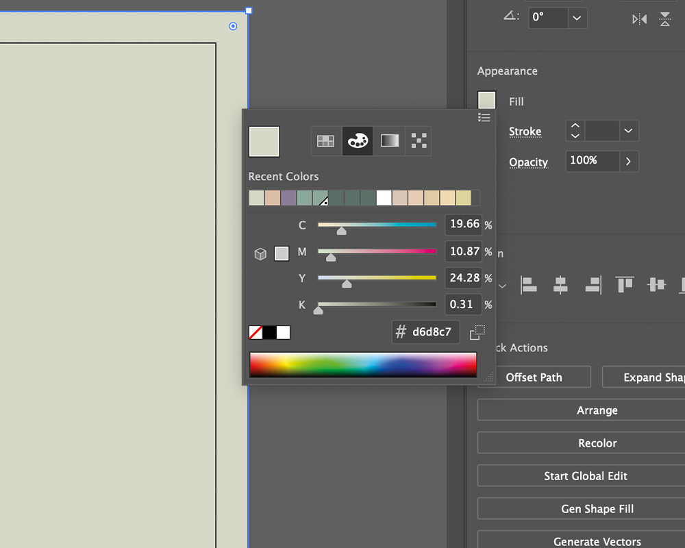
A colour profile defines how colours are represented and reproduced within a file. In printing, colour information must be translated into values that a printer can accurately reproduce using ink.
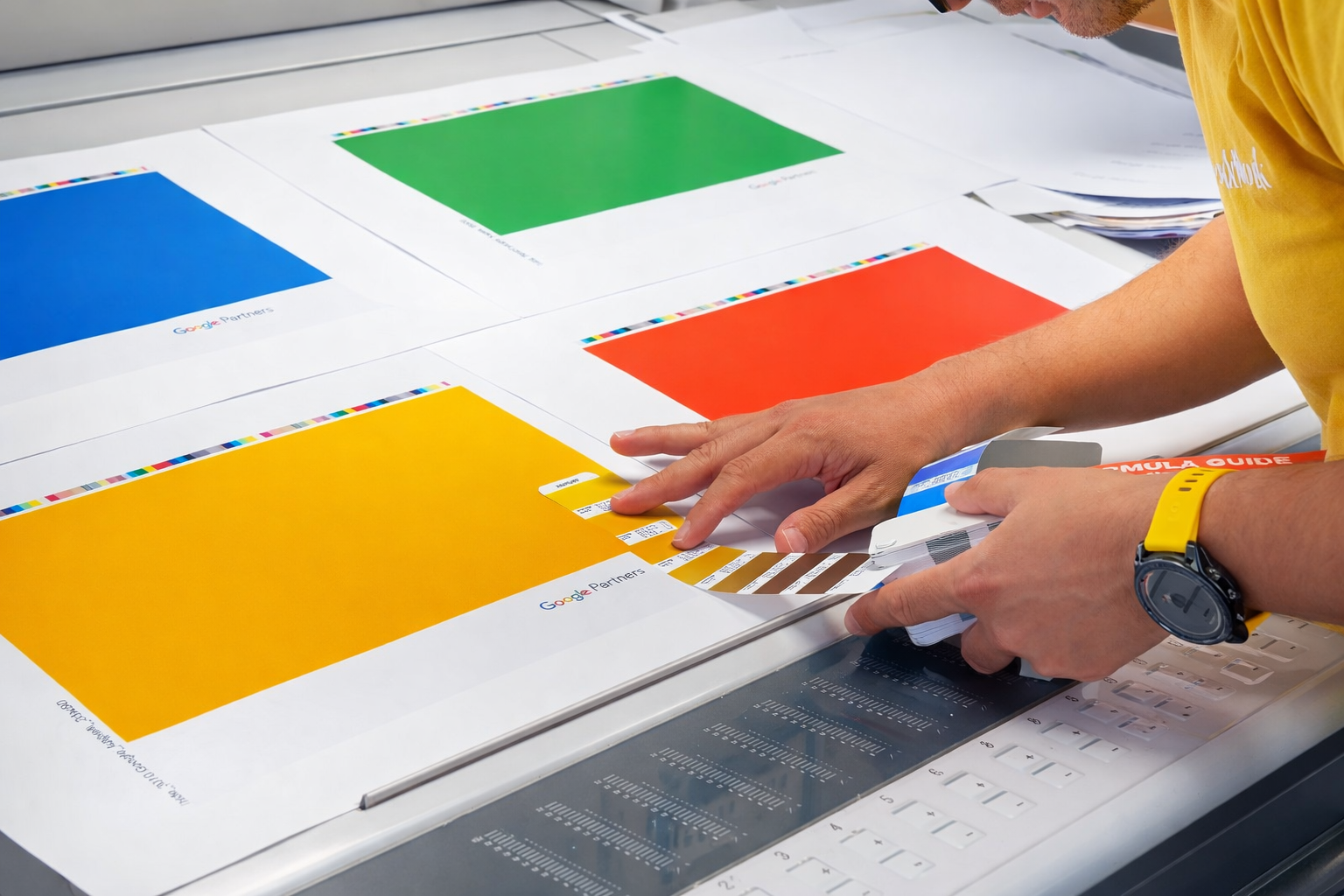
In professional print workflows, colour is separated into specific channels so that each ink used in the printing process can be applied precisely. For example, the most common full-colour printing method uses the CMYK colour model, which separates artwork into four colour plates: Cyan, Magenta, Yellow, and Black.
You can learn more about how colour separation works in print in the Bookblock guide:
Colour spaces like RGB and CMYK determine which colours can be displayed or printed, and each system is designed for a different medium.

Understanding RGB Colour Profiles
RGB (Red, Green, Blue) is the colour model used for digital screens such as laptops, phones, and tablets. Colours are created by combining light from these three channels at different intensities.
Because RGB uses light rather than ink, it can produce highly vibrant colours suited to digital displays. However, these colours are optimised for screens rather than printed surfaces.
When artwork designed in RGB is sent directly to print, it must be converted to a printable colour model. This conversion may introduce colour shifts because some colours available in RGB cannot be reproduced using printing inks.
For printed notebooks and inserts, artwork should therefore be supplied in the correct print-ready colour profile. As explained in Bookblock’s artwork setup documentation, RGB is intended for screen display, while CMYK is used for printing.
If your design has already been created in RGB, you can follow this step-by-step guide: How to convert a PDF from RGB to CMYK for printing
Understanding CMYK Colour Profiles
CMYK (Cyan, Magenta, Yellow, Key/Black) is the standard colour model used in commercial printing.
Unlike RGB, which combines light, CMYK works by layering coloured inks on paper. Each ink absorbs portions of light reflected from the surface, creating the final colour you see.
In four-colour printing, the artwork is separated into four channels corresponding to each ink. These separations are used to create printing plates that apply each colour layer in sequence.
Preparing artwork in CMYK ensures the printer receives colour data that matches the inks used in the printing process. This helps produce more reliable results and ensures colours are reproduced accurately on the final product.
Pantone Colours in Print
In some cases, designs require highly specific colour consistency that cannot be achieved through standard CMYK mixing. This is where Pantone spot colours are used.
The Pantone Matching System (PMS) is a standardised colour system used across the print and design industry. Each Pantone colour corresponds to a specific ink formula, allowing printers to reproduce the same colour consistently across different print runs and materials.
Instead of combining multiple inks like CMYK printing, Pantone colours are printed as pre-mixed spot inks. This allows for very precise colour reproduction and is commonly used for:
- Brand colours
- Logos
- Packaging and stationery
- Designs that require exact colour matching
Pantone colours can also be used within single-colour or two-colour printing setups, where one or two specific spot colours are used across the design.
When preparing files that use spot colours, designers should clearly define the Pantone colour within the artwork to ensure it prints correctly.

Why Colour Profiles Matter in Print Production
Correct colour profiles support several essential parts of the print workflow:
Accurate colour reproduction: Print files prepared in the correct colour model reduce unexpected colour shifts during production.
Consistent proofs and print runs: Colour management ensures proofs match the final printed result as closely as possible, improving quality control in the prepress process.
Predictable results across materials: Paper type, printing method, and ink behaviour all influence how colour appears. Using the correct profile helps maintain consistency across these variables. When artwork is set up correctly at the beginning, the print process becomes smoother and more predictable.
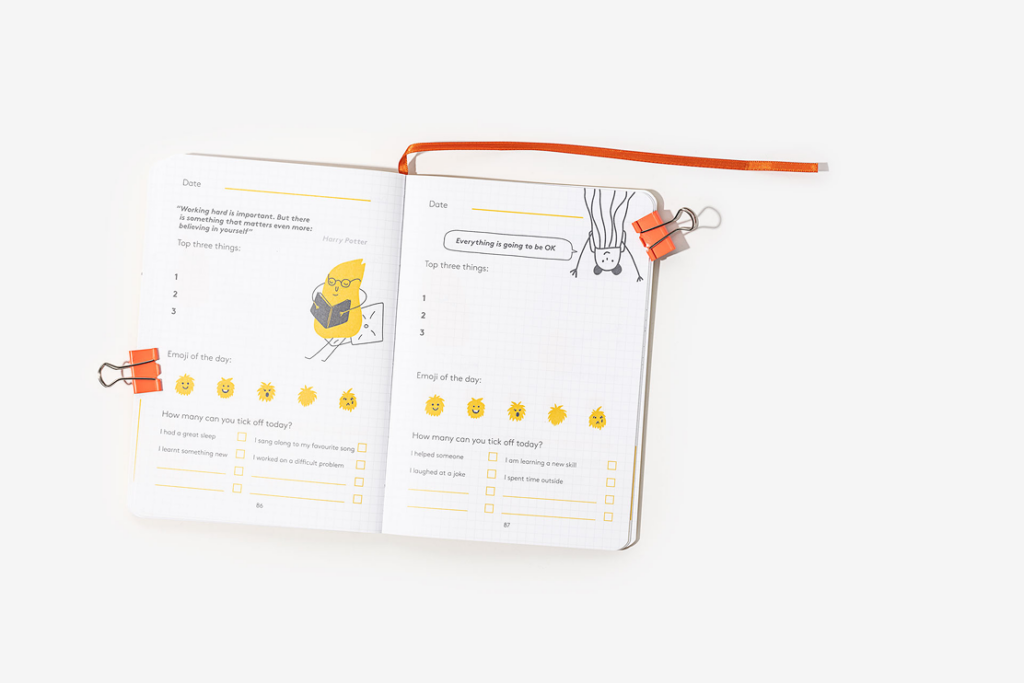
Greyscale and GCR in Print Files: Not all print projects require full colour. Many notebook interiors and printed inserts use greyscale or black-and-white printing.
Applying a GCR (Grey Component Replacement) greyscale profile converts colour artwork into shades of grey. This allows printers to build images using only black ink and the white paper underneath.
Different shades are created by varying the opacity and density of the black ink during printing.
If your project requires greyscale artwork, you can learn more here: GCR greyscaling for print files
Greyscale printing is often used for cost-effective interior pages or minimalist designs.

Single Colour Printing
Single colour printing uses only one ink colour throughout the design. This ink may be one of the standard CMYK colours or a specific Pantone spot colour.
Different tones or gradients are created by adjusting the density of the same ink, producing lighter and darker shades within the design.
Single colour printing offers several practical advantages:
- Simplified file preparation
- Reduced printing complexity
- A clean and minimal visual style
For guidance on setting up files correctly, see: Single colour printing artwork setup guide
Two-Colour Printing
Some designs benefit from a limited palette while still offering visual contrast. Two-colour printing uses two CMYK or Pantone inks within the same design.
This approach provides greater design flexibility while keeping production simpler than full-colour printing.
Two-colour printing is commonly used for:
- Notebook interior layouts
- Branded stationery
- Graphic illustrations or charts
You can explore the full setup instructions here: Two colour printing artwork setup guide

Best Practices for Preparing Print Artwork
When preparing files for notebook or book printing, keep the following workflow in mind:
- Design in the correct colour profile for your output
- Convert RGB artwork to CMYK before submitting files
- Use greyscale or limited colour setups when the print method requires it
- Review proofs carefully before final production
Following these steps ensures your design moves smoothly from digital artwork to a high-quality printed result.
Final Thoughts
Understanding RGB and CMYK colour profiles is essential for anyone preparing artwork for print. Colour spaces define how colours are interpreted, reproduced, and managed throughout the printing process.
By setting up files correctly, converting colour profiles when needed, and selecting the appropriate printing method—whether full colour, two-colour, or single-colour—you can ensure your printed notebooks and materials achieve the intended visual result.
For more technical guidance on artwork preparation and colour setup, explore the full set of resources in the Bookblock artwork guide: Notebook artwork setup resources and colour guidance