

Designing a journal works best as a structured process. Each stage builds clarity, from early research and content planning through to layout, assets, and production decisions. Working in this order helps ensure the journal feels usable, intentional, and ready for print.
1. Research the market and gather inspiration
Start by understanding what already exists and how journals are currently presented and sold. This gives context and helps you make informed decisions rather than designing in isolation.
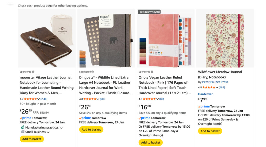
Look at existing journals for sale – browse Amazon to see bestsellers, pricing, formats, and customer reviews. Etsy is useful for spotting niche journals and creative approaches, while direct-to-consumer brands show how journals are positioned, photographed, and packaged.
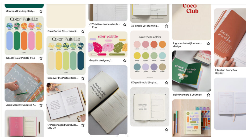
Use inspiration platforms to gather references
Pinterest works well for broad discovery, but pairing it with more curated platforms leads to stronger ideas.
- Same Energy for colour, tone, and visual mood
- Cosmos for editorial and brand-led inspiration
- Behance for full project breakdowns and layout systems
- Bookblock for off the shelf book block templates for custom journals
Use these tools to identify patterns, formats, and ideas that resonate, rather than focusing on individual designs.
2. Define the purpose and audience
Before designing anything, get clear on what the journal is meant to do and who it is for. This step shapes every decision that follows.
Clarify how the journal is used – decide whether the journal is guided or open, structured or flexible, daily or occasional. Think about how often someone will interact with it and in what context. Then define the audience clearly – consider who the journal is designed for, what stage of life they’re in, and what problem or habit the journal supports. This helps guide tone, structure, and complexity.
3. Plan the structure before designing pages
Before designing specific pages, it’s important to understand how the journal works as a whole. This stage focuses on structure, flow, and content rather than visual design. Use simple, collaborative tools which make it easy to experiment and make changes without redoing design work. A few examples
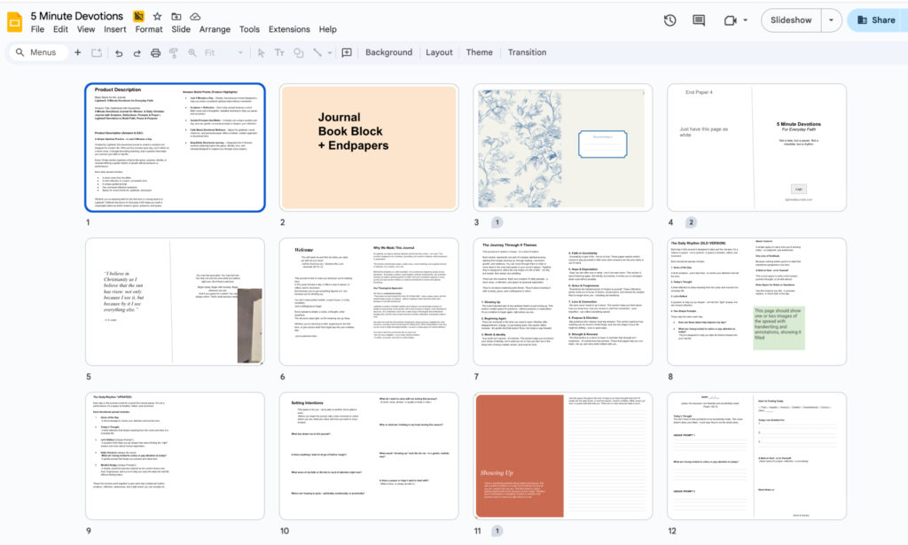
Google Slides
Treat each slide as a page or spread. This makes it easy to map the journal from start to finish, rearrange sections, test pacing, and block out where content or imagery will sit. Slides work particularly well for visual thinkers and collaboration.
Google Docs
Use Docs to write out all prompts, copy, and instructional text in full. This keeps content organised and allows you to refine wording and tone before layout begins.
Focus on flow and usability
Look at repetition, transitions between sections, and whether the journal feels intuitive when viewed from start to finish.
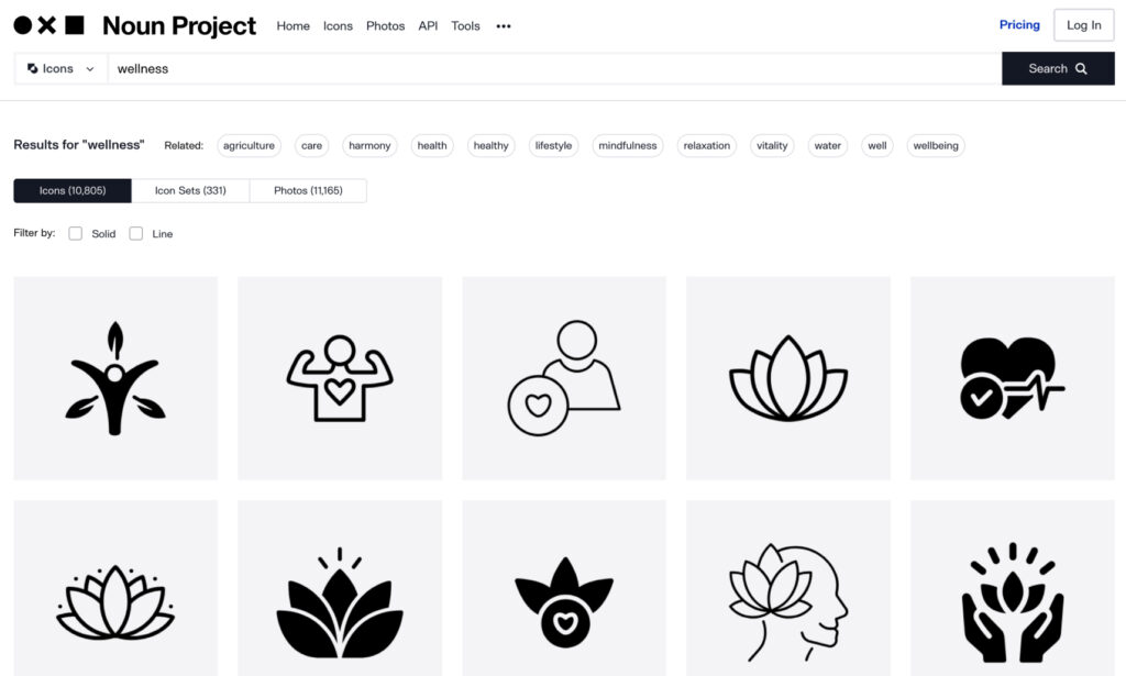
4. Source illustrations and visual assets
Visual elements can support the content and help set the tone of the journal when used consistently Illustration libraries, icon sets, and photography platforms can provide ready-to-use assets that save time and cost. Whilst AI tools can help generate conceptual illustrations or patterns when guided by a clear brief. These work best when used sparingly and aligned to a consistent style.
Useful resources to look at:
The Noun Project – icons and symbols
Humaaans / Open Peeps – illustration systems
Unsplash / Pexels – photography where appropriate
Public domain illustration archives
AI tools like Midjourney or DALL·E for conceptual visuals
5. Design the interior using the right tools
Once the structure is set, move into layout design with print in mind. Professional layout software such as Adobe InDesign is best suited for designing journal interiors, as it handles grids, typography, margins, and print exports properly. Illustrator can support diagrams, icons, or graphic elements where needed.
Tools like Canva can be useful for early concepts or sharing ideas, but final layouts should be built in print-ready software to avoid production issues later.
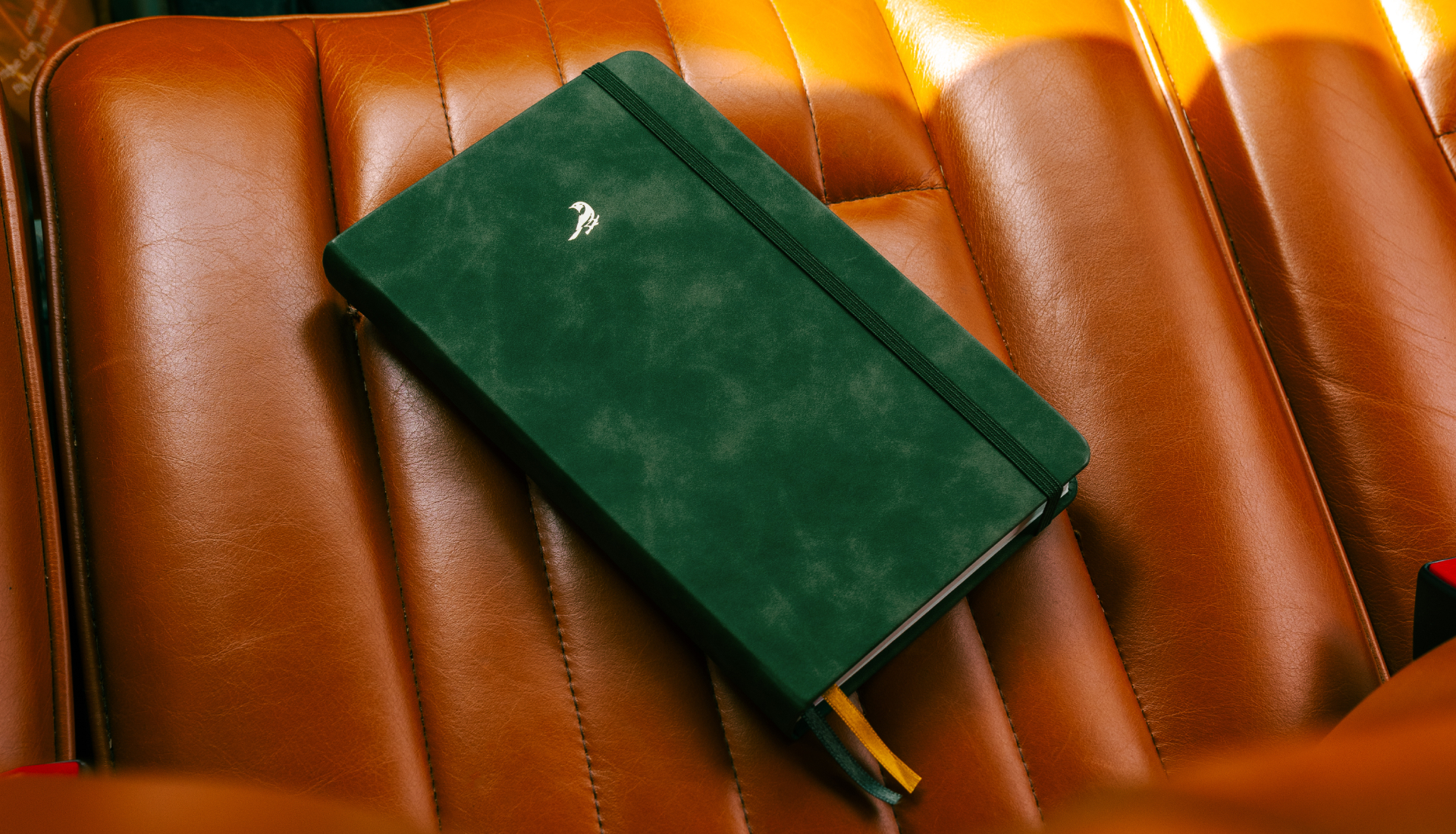
6. Choose materials and production details
The physical design of the journal should come after the interior has been properly thought through. The inside of the journal is the functional part – it dictates how the product is used, how it feels, and what kind of experience it creates. Layout, pacing, and typography all influence what the cover and physical format should be, so those decisions work best once the interior design is in place.
Once the internal design is clear, you can start thinking about the physical characteristics of the journal. This includes the size, binding, paper stocks, cover materials, colours, and any finishing details such as debossing, foiling, or printed elements. At this stage, it’s useful to build mood boards and reference materials again, this time focused on physical products rather than layouts or content, to help narrow down the overall direction.
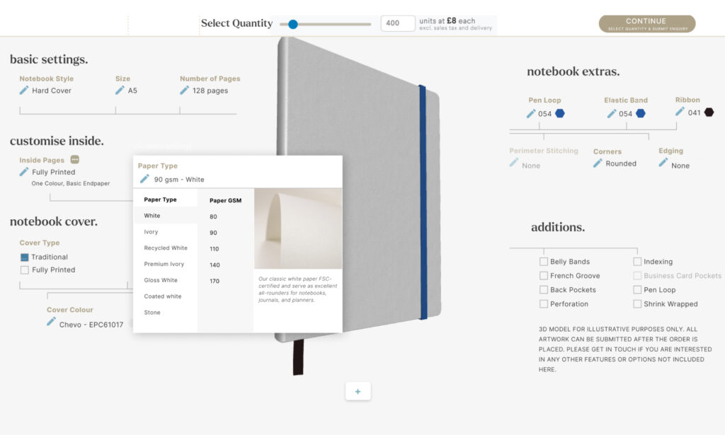
With a broader idea of the physical product, it’s worth speaking to a manufacturer like Bookblock to understand what’s possible and whether there are any practical limitations. Material choices, paper stocks, and finishes all affect unit cost, but in many cases the difference between options is smaller than expected, particularly when producing for retail at scale. Expensively sourced or highly specialised materials are the main exception.
Having these conversations early helps align design ambition with budget and avoids unnecessary compromises later. A manufacturer can also guide decisions around durability, usability, and cost efficiency, making it easier to refine the product before moving into final production.